02 / 06
Israel Akintunde
Branding · Personal Brand Design
Created a personal brand for Israel that feels true to who he is and the work he does, bringing his love for design, code and culture into one simple, recognisable identity.
- Role
- Brand Designer
- Year
- 2026
- Scope
- Research, Branding, Logo Design
- Tools
- Figma, Adobe illustrator
Overview
Israel Akintunde is a creative professional whose work sits around design, code and culture. The goal was to build a personal identity that felt like him confident and expressive, but still clean enough to let the work speak for itself. I developed the visual identity from the logo through to the wider brand system and applications.
THE CHALLENGE
Personal brands can easily end up feeling too corporate or, on the other end, too dependent on trends. The challenge was creating something with enough personality to be recognisable as Israel’s, while still being flexible enough to grow with his work and show up across different spaces.
BRAND DIRECTION
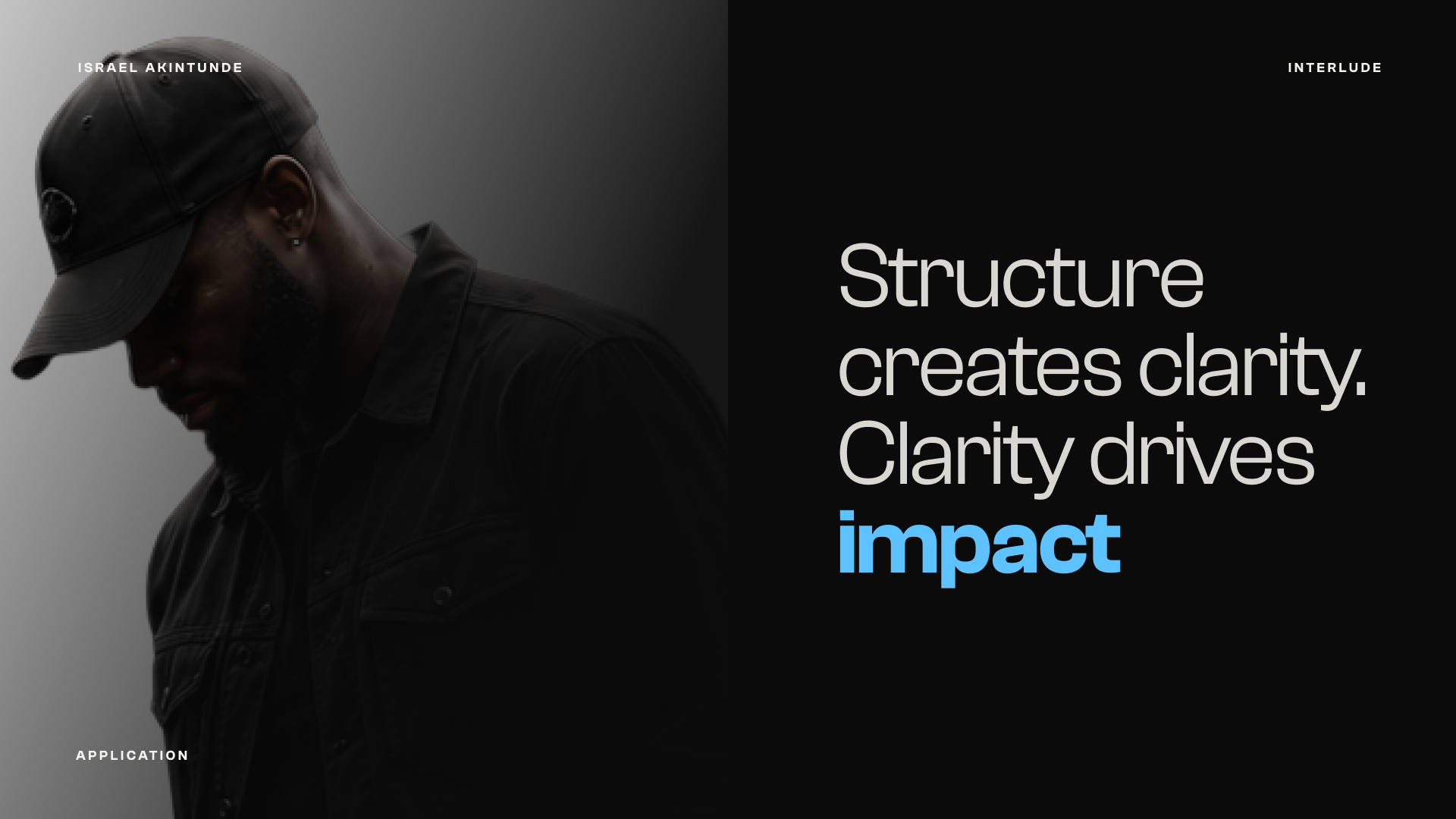
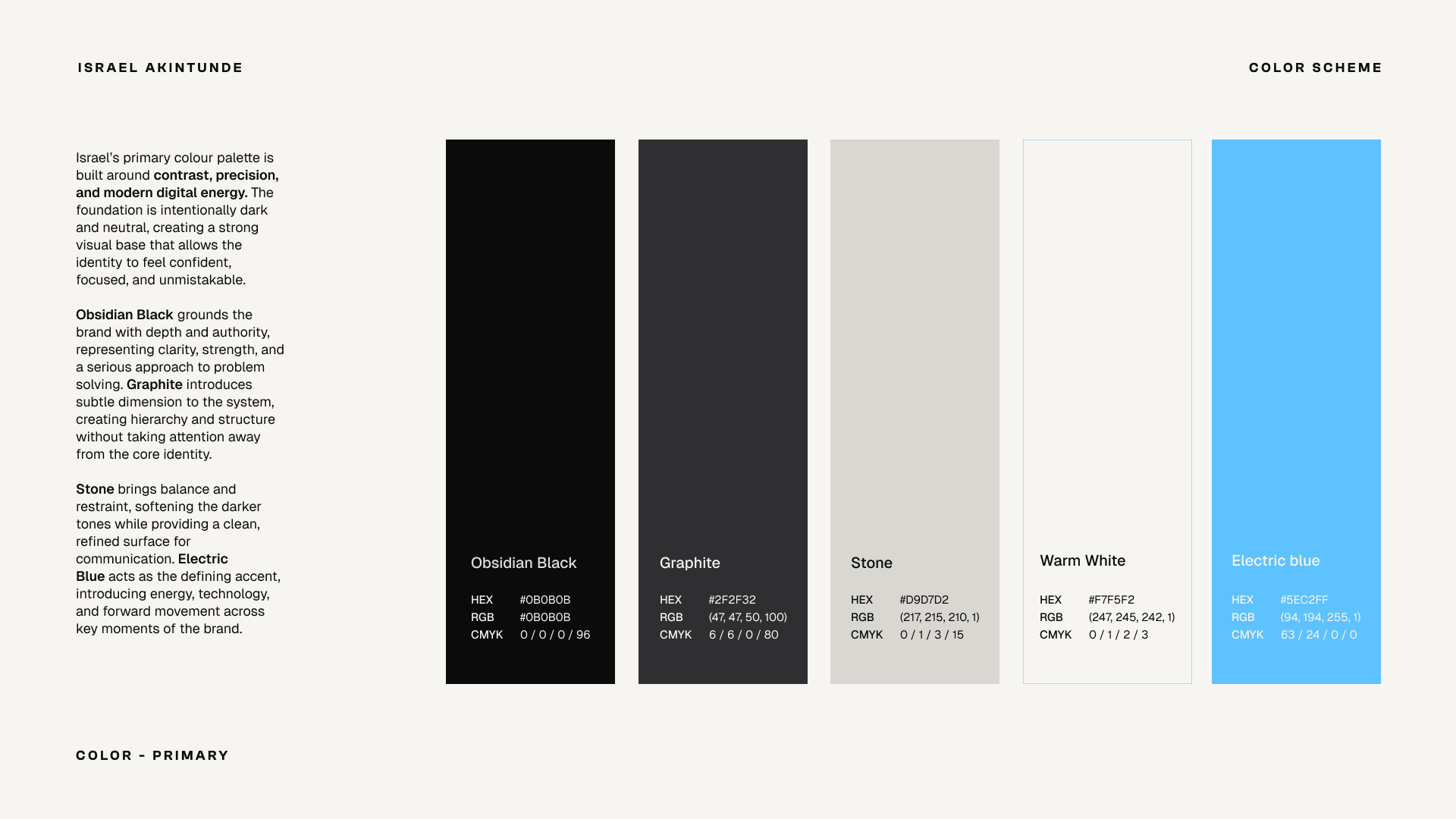
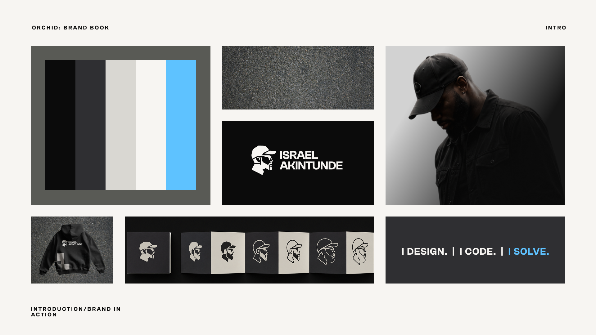
The direction was built around contrast: structured but expressive, minimal but not quiet. A mostly monochrome palette keeps things grounded, while the bright blue brings energy into the system and gives the brand a distinctive visual cue.
LOGO EXPLORATION
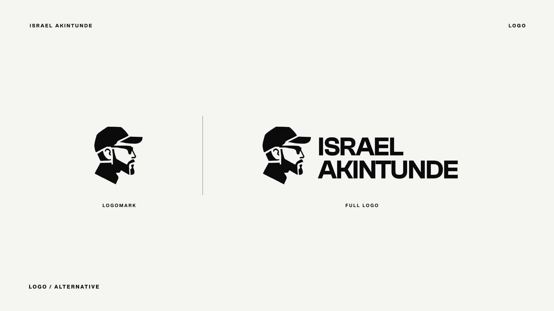
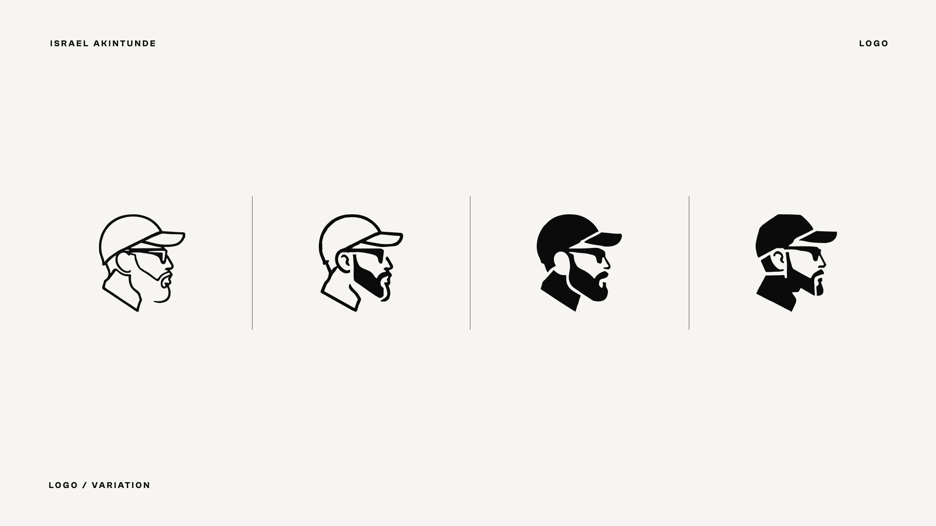
The logo started with the idea of creating a mark that felt personal rather than just turning initials into another monogram. I explored different levels of detail and abstraction around Israel’s profile before refining it into a bold, recognisable silhouette that could work both on its own and alongside the wordmark.
VISUAL IDENTITY
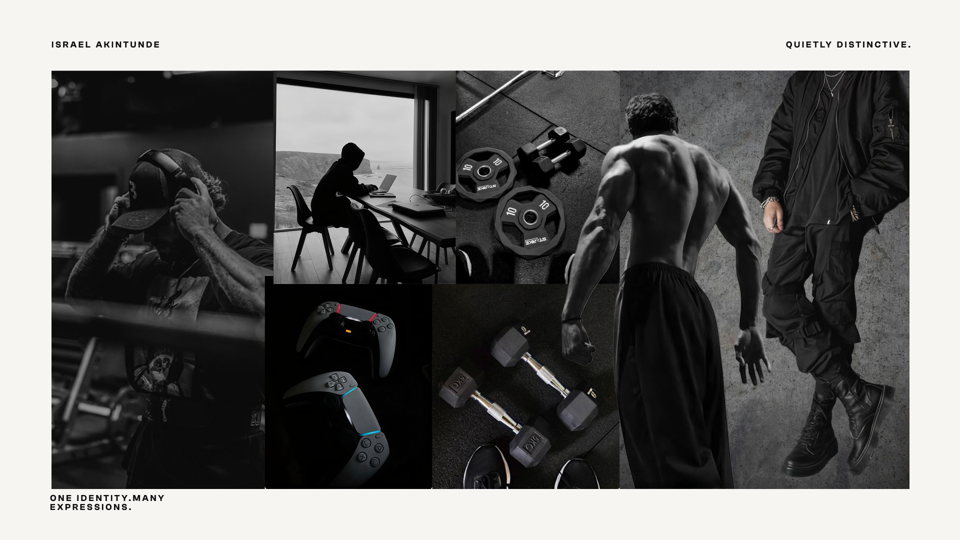
The final identity pairs the illustrated logomark with bold typography, a restrained black, white and grey palette, and a sharp blue accent. Strong layouts, photography and graphic elements give the system room to change depending on the context without losing its character.
Obsidian Black
#0B0B0B
Warm White
#F7F5F2
Graphite
#2F2F32
Stone
#D9D7D2
Electric blue
#5EC2FF
Primary typeface
Aa
IBM plex sans
ABCDEFGHIJKLMNOPQRSTUVWXYZ abcdefghijklmnopqrstuvwxyz 0123456789
Secondary typeface
Aa
Geist
ABCDEFGHIJKLMNOPQRSTUVWXYZ abcdefghijklmnopqrstuvwxyz 0123456789
BRAND IN USE
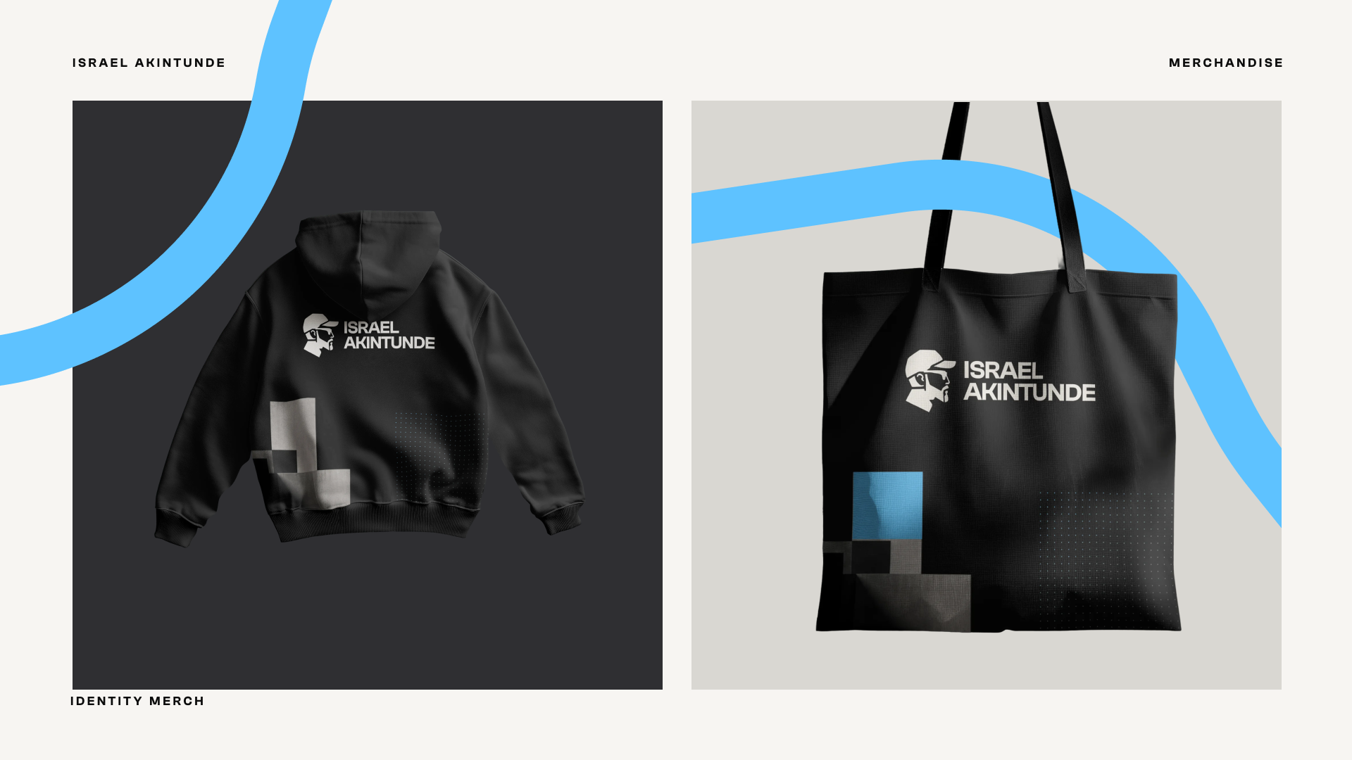
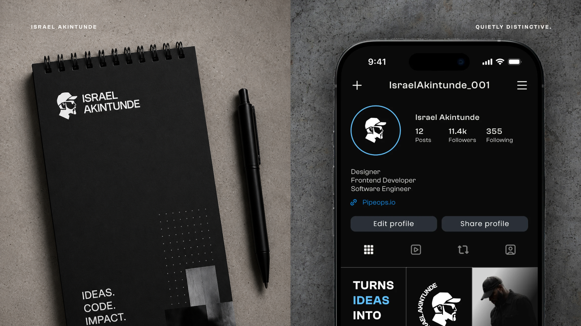
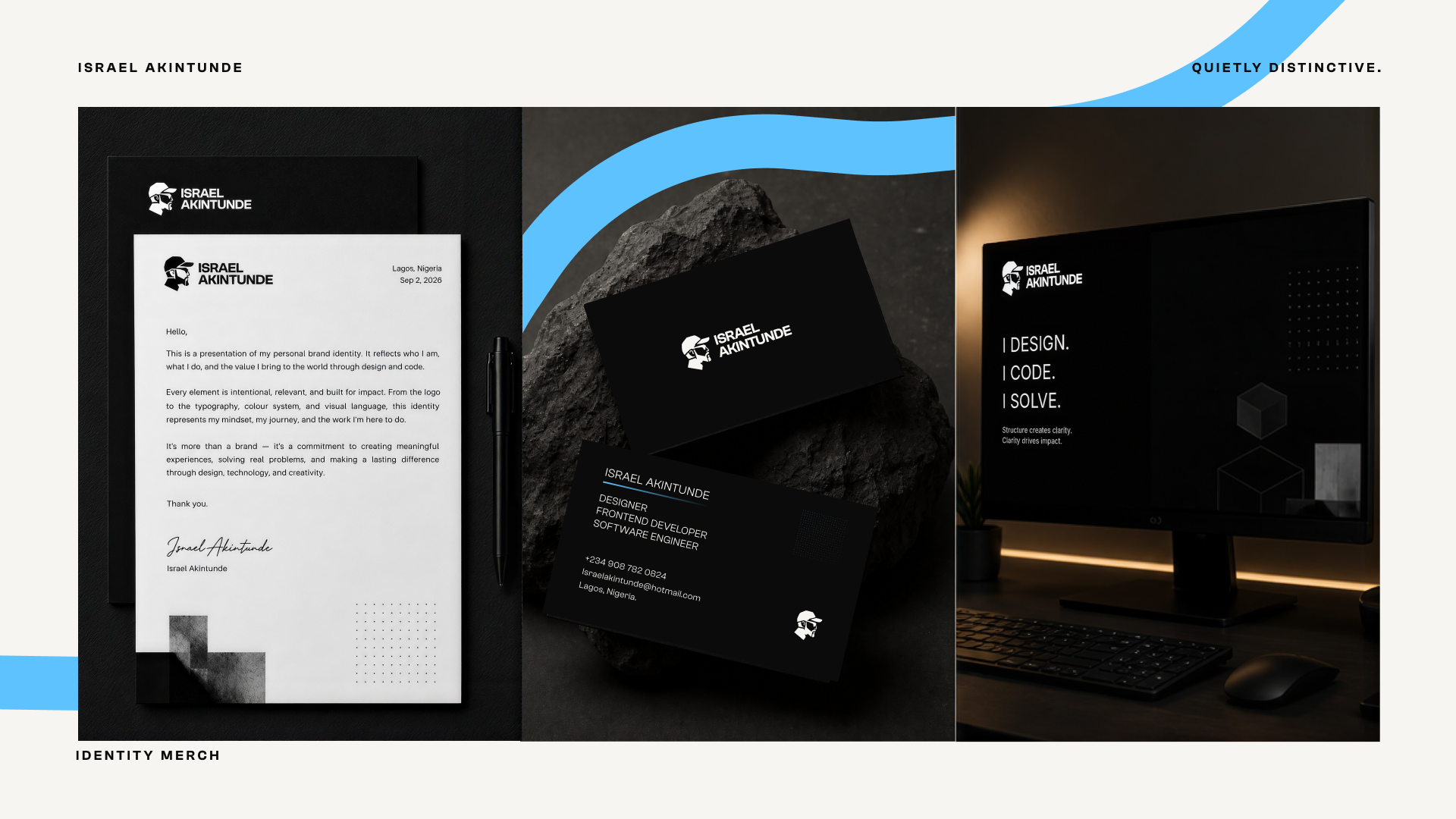
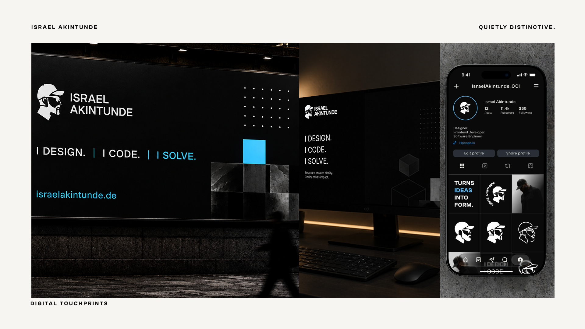
The identity was extended across social media, stationery, apparel, tote bags, digital screens and other brand touchpoints. Seeing the system across different applications helped make sure it wasn’t just a logo that looked good on a page, but an identity that could actually live and move with the brand.
OUTCOME
The result is an identity that feels distinctly personal to Israel while still giving him a consistent system for presenting his work. The project reminded me that a personal brand doesn’t need to say everything about someone at once — sometimes a few strong, repeatable elements can say much more.